

Brand builder & Design archivist. @bpandopinion & @LogoArchive & @BrandArchivexyz
Joined April 2009
- Tweets18K
- Following670
- Followers13.2K
- Likes26.8K


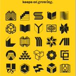
Pinned Tweet
Resources for designers I’ve built over the last decade.
1. brandarchive.xyz
2. bpando.org
3. logo-archive.org
4. logohistories.com
5. portalto.xyz

Rich Baird retweeted

From Tokyo 1964 to NTT: the stories behind Yusaku Kamekura's most famous logos → logohistories.com/p/yusaku-k…


Rich Baird retweeted

The work of Ben Bos, the Netherlands, 1968–1975.
Discover thousands more historical logos at logo-archive.org?utm_source=…
Ben Bos’s logos for Kluwer Uitgeverij (1968), Furness Group (1968, with Total Design), Buhrmann-Tetterode (1974) and the City of Dronten (1975).
#logos #branding #benbos #totaldesign #dutchdesign #logodesign


Rich Baird retweeted

Shorter and sharper: Denmark's National Gallery becomes SMK in eTypes' bold new identity – a crown emblem, a hardworking frame and Playtype's Hill in chunky caps. See the full identity → bpando.org/2026/11/12/smk-st…


Rich Baird retweeted
When Siemens AG was formed in 1966, it inherited what its own historians describe as “branding chaos”. Rather than commission something new, it promoted the Siemens & Halske mark – Hans Domizlaff’s S&H monogram above the SIEMENS word mark – to umbrella mark for the whole group, and reinterpreted the monogram as the “House of Siemens”.
By 1970 the mark looked dated and was hard to read at small sizes. Rather than settle the question on taste, Siemens asked the psychologist Reinhold Bergler to test eight new logotype variants. Test subjects still read the monogram as Siemens & Halske, and found the advertising managers’ favourite, a dotted “i”, poorly legible, faddish and facetious.
On 1 October 1973 Siemens dropped the monogram entirely and made the SIEMENS name, in the same lettering as before, the company mark.
Read the full story behind the logo → logohistories.com/p/siemens-…


Rich Baird retweeted
Bilbao’s metro was first proposed in the 1920s, but a plan was only approved in 1987. The underground stations were awarded to Sir Norman Foster and partners after an open competition, and the architects then worked with Otl Aicher to develop a wayfinding system, visual language and logo.
Rather than focus on an ‘M’, Otl Aicher favoured an abstract form based on the notion of tunnels and wheels in motion: three overlapping rings of gradually increasing weight from left to right, giving an impression of forward momentum and complementing Foster’s ring-like station entrances.
“Otl’s skill was somehow encapsulating the spirit of the idea or a place with a combination of line, colour, graphics,” said Norman Foster. Alongside Munich Airport, Metro Bilbao was Aicher’s last major commission before his death in 1991, and it remains largely unchanged.
Read the full story behind the logo → logohistories.com/p/metro-bi…


Rich Baird retweeted
From Chase Manhattan to NBC: the stories behind Chermayeff & Geismar's most famous logos → logohistories.com/p/chermaye…


Rich Baird retweeted
Swedes Love Fish. Just Not All Year.
Read Lisa's review → bpando.org/2026/11/11/swedes…
Packaging expert Lisa Cain shares her opinion on Pond Design’s visual identity and packaging for Swedish seafood brand Korshags.
#branding #design #packaging


Rich Baird retweeted
The work of Paul Rand, USA, 1960–1989.
Discover thousands more historical logos at logo-archive.org?utm_source=…
Paul Rand’s logos for Westinghouse (1960), Columbus Indiana Visitors Bureau (1973), Tipton Lakes (1980) and Monell Chemical Senses Center (1989).
#logos #branding #paulrand #americandesign #logodesign


Rich Baird retweeted
Across Switzerland – Hans Hartmann's 1972 logo for Swiss Federal Railways. Read the full story → logohistories.com/p/swiss-fe…


Rich Baird retweeted
As jets arrived, airlines needed identities that worked everywhere from tail fins and check-in desks to tickets and timetables. From Lufthansa’s crane to United’s tulip, the stories behind twelve airline logos → logohistories.com/p/airline-…


Rich Baird retweeted
Otherway's new identity for The Whisky Exchange balances heritage with a more contemporary spirit. See the full project → bpando.org/2026/11/10/otherw…


Rich Baird retweeted
By the mid-century, Canadian National Railways had replaced steam with diesel, upgraded its fleet and restructured. Yet a study of 4,000 Canadians found the improvements were going unnoticed: the public still saw the railway as old-fashioned.
Jim Valkus was brought in to close the gap, and handed the logo to Canadian designer Allan Fleming. On a flight to New York, Fleming sketched ideas on a cocktail napkin, joining the C and N into one continuous line. “It’s a route line that incidentally spells CN,” he explained. “It represents the movement of people, materials, and messages from one point to another.”
The flowing ‘signature logo’, later known as the CN ‘Worm’, was a risk and a departure from the railway heralds of the past. In the words of Lorne Perry, who rolled out the programme, it became “a powerful moving billboard for CN’s powerful trains”.
Read the full story behind the logo → logohistories.com/p/canadian…


Rich Baird retweeted
Owls from the archive.
Discover thousands more historical logos at logo-archive.org?utm_source=…
By Ernst Roch (Owl Bar, Canada, 1973), Hiroyuki Kinoshita (Okinawa Fuji Hotel, Japan, 1973), Akiteru Nakajima (Art and Graphic, Japan, 1981) and Miloš Ćirić (Biblioteka Savremena Društvena Misao, Yugoslavia, 1969).
#logos #branding #symbols #owl #logodesign


Rich Baird retweeted
By the 1980s HongkongBank was considered a pioneer of modern banking in a number of countries, however, its corporate identity didn’t reflect this. Expansion to over 1,000 branches and a controlling stake in New York’s Marine Midland Bank started to create consistency issues. The bank appeared less unified the more it grew.
Henry Steiner drew from the bank’s cross-cultural foundation, a British institution founded on ‘sound Scottish banking principles’ that had always adopted local beliefs and traditions. His logo grouped four isosceles triangles into a hexagon that could be read as inward and outward facing arrows pointing east and west, with the ‘X’ at its centre evoking the Saltire, the flag of Scotland.
Rather than the blue of the Scottish flag, the logo would be a vibrant red, a colour important to Chinese culture and already used on the bank’s money boxes and passbooks. In the spirit of feng shui, its four arrows were presented to management as the four poles, and business coming from all directions.
Read the full story behind the logo → logohistories.com/p/hsbc-log…


Rich Baird retweeted
Some of the most rigorous identity programmes of the 1950s–70s were made for steelworks, chemical plants and paper mills. The stories behind eight industrial logos → logohistories.com/p/industri…


Rich Baird retweeted
In the early 1970s, Siemens commissioned psychologist Reinhold Bergler to test eight new logotypes against its 1966 company mark. The in-house favourite, a dotted "i", was judged faddish and facetious. The result ended a monogram's career of more than seventy years.
The full story will on LogoHistories.com this Tuesday.
