

Certified Financial Technician - CFTe | Financial Analyst & Educator | Media Presenter | Keynote Speaker | News Corp columnist | Founder of MtM
Joined January 2022
- Tweets4.7K
- Following101
- Followers22.2K
- Likes3.7K




Pinned Tweet
Pretty cool milestone to share.
Due to the success of the weekly online articles, my ASX Trader column will now also be published in print every Tuesday across the major News Corp newspapers.
So if you're old school like me and still enjoy grabbing a physical paper, keep an eye out each Tuesday in publications including The Courier-Mail, The Daily Telegraph, the Herald and other News Corp papers around Australia.
The print edition will be a condensed version, to fit on one page, of my weekly online article, breaking down what I'm seeing across markets, where money is flowing and the areas I'm watching next.
This week we're looking at why the miners are starting to outperform the metals themselves, particularly across gold and silver, and why Australia's emerging companies (small caps) could be approaching an important period.
There's still something pretty cool about seeing your work in an actual newspaper.
Grab yourself a copy every Tuesday. 🗞️📈

At what point will people finally realise that energy is in a bull market?
This is what we call the disbelief stage of a bull market. It's exactly what I saw with silver in early 2025.
Everyone thinks energy is only rising because of the war. They're scared to invest because they believe that once the war ends, energy prices will collapse and the sector will return to a bear market.
But here's what they're missing.
Energy was already showing extremely bullish signs long before the war even started.
The war didn't create the underlying bullish market structure. It simply gave people a reason to explain the move.
That's the beauty of studying long-term market cycles. While everyone else is focused on today's headlines, the charts can be telling a completely different story.
Bull markets often begin when most people still don't believe they're real.

David Bird (ASX Trader) B.Ed, CFTe retweeted

It made an explosive move and is now deep in the trenches of a dive. But this asset is trading at a 60 per cent discount that could define the next commodity boom, writes ASX Trader. ✍️ READ MORE: bit.ly/48dMUHR

THE STOCK MARKET DOESN'T CRASH. IT REVERTS TO THE MEAN!
The other week, I talked about how markets don't just crash, they revert to the mean, and how valuations eventually reset when prices become too stretched.
Well, let me show you how this plays out on the S&P 500 weekly chart, dating back to 2018.
The blue line represents the 100-week moving average, which is simply the average price over the past 100 weeks.
Now, notice something interesting?
Almost every major correction highlighted on this chart occurred after the market had moved approximately 15% to 20% ABOVE its moving average.
And what happened next?
The market corrected back towards that average!
Even before the COVID crash, the S&P 500 was already around 18% above its moving average. COVID was the catalyst, but the market was already extremely stretched.
Then panic took over, and prices fell more than 20% BELOW the average.
And what happened next? Mean reversion again!
SO WHERE ARE WE TODAY?
Once again, the S&P 500 has recently been trading around 15% to 20% above its 100-week moving average.
So when we eventually experience another significant correction, is it really a crash?
Or is it simply a market that's moved too far, too quickly, and needs a healthy retracement?
BUT HERE'S THE IMPORTANT PART!
This behaviour is particularly common during bull markets, where the moving average often acts as support.
However, during major bear markets, like the GFC or dot-com crash, things can change dramatically.
Instead of bouncing off the moving average, prices can break below it and continue falling.
That same moving average can then become RESISTANCE rather than support. And that's why understanding the broader market cycle is so important.
Remember, Markets don't move in straight lines forever. They become overextended, correct, recover and repeat.
Mean reversion doesn't tell us exactly when a correction will happen, but it helps us understand when markets are becoming stretched.
Sometimes what everyone calls a market crash is simply an overextended market returning towards its long-term average.
The real question is whether that correction is happening within a bull market or marking the beginning of a bear market.

TEXTBOOK ACCUMULATION!
FCG, the natural gas ETF, has spent the last 10 years in what looks like textbook accumulation.
A beautiful inverse head and shoulders pattern, with price breaking through the neckline and successfully retesting it this year.
Now we're approaching a major descending resistance line stretching all the way back to the GFC highs on fantastic volume!
What I find hilarious is that people still haven't clued on that energy is in a bull market.
Energy has been one of the easiest trades of 2026, yet so many still believe the strength is temporary and simply driven by the war.
I love it!
The bigger the accumulation, the bigger the potential move.


David Bird (ASX Trader) B.Ed, CFTe retweeted

Three new voices are taking the CryptoCon stage. 🚀
Speakers from @MtM_Australia are joining the conversation, bringing fresh perspectives from across crypto, blockchain, Web3 and digital assets to help you cut through the hype and stay ahead of what’s next.
More voices. More insights. More speakers coming soon...
📍 ICC Sydney
📅 28–29 November 2026
🎟️ FREE General Admission
David Bird @ASX__Trader | Mastering The Markets
Founder
Industry: Stock Market Investing
Craig Tapping | Mastering The Markets
Head Educator and Analyst
Industry: Trading / Investor Education
@tungasaurus | Mastering The Markets
Educator
Industry: Investment Education / Macro Investing
#CryptoCon #CryptoAustralia #Investing #StockMarket
Worth a watch if you want to understand what is happening right now.

The market’s next winners could be yesterday’s laggards. 👀
Mastering the Markets’ David Bird reveals the sectors he thinks are primed to outperform — and where he sees trouble brewing ☕
Catch the full interview here 👉 ausbiz.co/4i22SLa
#asx200 #toppicks #technicals #ausbiz

Most people will be blindsided by what's coming, just like they were with the housing crash.
Preparation is the key to success

On the 20th of July, I appeared on @ausbiztv 'The Call', where we discussed NEXTDC (NXT).
Now, don't get me wrong. The data centre thematic is incredibly strong. Cloud computing and AI are booming, and the amount of money being poured into this space is extraordinary.
But there's a big difference between a great industry and a great investment.
I shared two of my favourite sayings:
"Money never leaves the market, it just rotates from overvalued to undervalued."
"The market loves what you hate and hates what you love."
And this is exactly why I was concerned about NEXTDC.
Everyone loved the stock. Sentiment was extremely bullish, and that's often when I start getting cautious.
Why? Because when everyone wants to own something, who's left to buy?
The charts were already telling us something wasn't right.
We had bearish divergence forming around $18, followed by lower highs around $17 and $16.
I specifically highlighted the $11 level and warned that if it broke, we'd see a change in market structure and things could turn bearish very quickly and to get out as fast as you can. Charts led the news.
At the time, I also explained why I believed we were seeing a massive rotation out of growth sectors and into more defensive areas of the market.
Fast-forward to today.
NEXTDC broke below $11, and just look how quickly things turned bearish!
It's another great reminder that you can have an incredibly bullish long-term story, but that doesn't necessarily mean the share price is going higher.
Price action is king.
Mastering the Markets Pty Ltd (ABN 99 671 639 704) is a Corporate Authorised Representative (CAR 001309433) of ShareX Pty Ltd (AFSL 519872). Content is general educational information only, not personal financial advice, and does not consider your individual objectives, financial situation or needs. Please consider your own circumstances and seek independent financial advice before making any financial decisions.


PLATINUM: IS THE BULL MARKET OVER, OR HAS IT ONLY JUST BEGUN?
One thing I've learned over the years is that you can gain a lot by studying the personality of a chart.
Every asset has its own characteristics, and when you zoom out, some of these cycles become incredibly obvious!
Those who follow me will remember that back in May 2025, when platinum was below US$`1,000, I wrote about why I believed it was preparing for an explosive move higher.
couriermail.com.au/business/…
And explode it did, surging towards US`$3,000!
But was that the entire move, or is there something much bigger still to come?
LET'S LOOK AT THE LAST 50 YEARS.
1970s: Look at the first green arrow. Platinum broke out, experienced a deep retracement, and then went on a powerful bull run that peaked in 1980 at our first red arrow.
What followed was a brutal 20-year bear market!
2000: After two decades, platinum finally broke its declining trend again. And guess what happened?
Almost exactly the same thing!
A breakout, a deep retracement, followed by another powerful bull market that peaked in 2008.
Then came another 17-year bear market!
2025: Platinum finally broke that long-term declining resistance again, exactly what I highlighted back in May.
And once again, we've seen an explosive move higher followed by a significant correction.
See the pattern?
BREAKOUT → DEEP RETRACEMENT → MULTI-YEAR BULL MARKET.
That's the personality of platinum!
SO WHERE COULD IT GO NEXT?
Look at the long-term rising channel. Both the 1980 and 2008 peaks occurred near the upper resistance line.
If history repeats, that upper resistance could eventually take platinum towards US 6,500 over the coming years.
That's our next red arrow!
Of course, nothing is guaranteed. But what fascinates me is that the previous two bull markets developed over many years, yet people are already declaring this one finished after its first explosive move.
Markets don't move in straight lines. They zig, they zag, and often shake people out before the larger trend continues.
Maybe this time is different. But if platinum is following its historical personality, this bull market could have years left to run!

These economists are always late to the party. I Wrote about it 18months ago when they had just been cutting.
couriermail.com.au/business/…


AUSTRALIAN PROPERTY VS SHARES: IS ANOTHER MAJOR ROTATION COMING?
I've put together this chart using historical data from the Federal Reserve Bank of St. Louis (FRED), comparing Australian residential property prices with Australian share prices since 1970.
What I find fascinating is how clearly it highlights the long-term cycles between these two asset classes.
FIRST, HOW DO YOU READ IT?
The bottom chart measures the property-to-shares price ratio.
🔴 RED ZONE (Above 1.17): Property has significantly outperformed shares. Historically, this has been a potential opportunity to rotate from property into shares.
🟢 GREEN ZONE (Below 0.65): Shares have significantly outperformed property. Historically, this has been a potential opportunity to rotate from shares into property.
🟢 WHEN PROPERTY WAS RELATIVELY CHEAP
Three important historical readings:
• 1987: Ratio 0.41
• 2000: Ratio 0.60
• 2007: Ratio 0.63
These periods were followed by stronger relative performance from Australian property.
For example, from the 2007 share market peak through to early 2026:
🏠 Australian property: +147%
📈 Australian shares: +35%
That's property outperforming shares by approximately 112 percentage points in price growth.
🔴 WHEN SHARES WERE RELATIVELY CHEAP
Now look at the opposite extremes:
• 1974: Ratio 1.45
• 1982: Ratio 1.27
• 2009: Ratio 1.16
• 2022: Ratio 1.25
Following the elevated readings in the 1970s and early 1980s, Australian shares went on to significantly outperform property over the longer term.
The ratio eventually fell from 1.27 in 1982 to just 0.41 in 1987, showing how dramatically relative performance can change.
WHERE ARE WE IN 2026?
The ratio currently sits around 1.18, putting it back in the historical red zone.
This tells us that Australian property has once again become relatively expensive compared with Australian shares, based on this historical measure.
Does that mean property must crash? No.
It simply suggests that, based on previous cycles, Australian shares could be better positioned for relative outperformance over the coming years.
Remember, this chart compares price growth only. It excludes dividends, rental income, costs and leverage.
WHY I BELIEVE AUSTRALIAN SHARES COULD OUTPERFORM PROPERTY
You'll notice that sentiment towards Australian shares is generally pretty negative. Everyone seems to think the US is the only place worth investing. But that's exactly the type of sentiment I like to see when looking for long-term opportunities.
Australia is one of the most resource-rich countries in the world, and if you saw me speak at the Australian Gold Conference last week, you'll understand why I believe the commodity supercycle is only just heating up.
For example, our small cap index, which is majority a resources sector isstill trading significantly below it's GFC peak, having spent nearly two decades in a major accumulation phase.
Think about that. Almost 20 years of going nowhere while other asset classes have soared.
Sometimes the best opportunities are hiding in the markets nobody wants to own.
From 1980 to 2007, Australian shares generally outperformed property. Since the GFC, Australian property has significantly outperformed shares. Now we're back at a historical extreme that has previously been associated with major changes in market leadership. This is why understanding market cycles and relative valuations is so important. The best-performing asset class of the last 20 years isn't necessarily going to be the best-performing asset class of the next 20.
As the great Wayne Gretzky famously said, "Skate to where the puck is going, not where it has been."
The same applies to investing. The biggest opportunities often come from positioning yourself for the next market cycle, rather than chasing the winners of the last one.

AUSTRALIAN PROPERTY HAS SMASHED SHARES SINCE THE GFC. BUT WILL IT CONTINUE?
Here's a fascinating chart comparing Australian residential property prices with Australian share prices over several decades. And it highlights something I've spoken about for years.
MARKET CYCLES MATTER.
From around 1980 until the GFC in 2008, Australian shares generally experienced stronger price growth than residential property.
But since the GFC, the tables have turned.
Australian residential property has significantly outperformed Australian shares in terms of capital growth.
LET'S LOOK AT THE NUMBERS.
If you invested near the pre-GFC share market peak in late 2007 and held until early 2026, here's how the two asset classes performed:
🏠 Australian property: +147%
📈 Australian shares: +35%
That's a staggering difference of 112 percentage points!
Think about that.
If you bought Australian shares near the peak of the pre-GFC share market boom in 2007, the share price index has increased by just 35% over more than 18 years before inflation and excluding dividends. Not exactly spectacular capital growth, is it? Meanwhile, Australian residential property prices have increased approximately 147% over the same period.
SO WHY DOES THIS HAPPEN?
Different asset classes go through periods of outperformance and underperformance, sometimes lasting decades. Interest rates, credit availability, economic growth, population growth, corporate earnings and investor sentiment all influence these cycles. For example, Australia's standard variable mortgage rate reached approximately 17% in 1989, before falling to around 6% by 2002. Lower borrowing costs helped support property prices, while Australian shares experienced their own periods of strong growth, particularly during the resources boom. But here's something important.
PRICE GROWTH IS NOT THE SAME AS TOTAL RETURNS.
This chart measures changes in asset prices. It doesn't include rental income from property or dividends from shares. It also doesn't account for borrowing costs, maintenance, transaction costs, taxes or the impact of leverage. These can make a significant difference to an investor's actual returns, particularly when dividends and rental income are reinvested. And there's another important consideration.
YOUR STARTING POINT MATTERS.
Here's something fascinating. Change the starting point from the pre-GFC share market peak in late 2007 to the share market bottom during the GFC in early 2009, and the results look remarkably different.
🏠 Australian property: +158%
📈 Australian shares: +154%
Almost identical capital growth!
Same two asset classes. Same ending date. Completely different conclusions depending on when you invested. An investor buying an asset at historically cheap valuations can experience a very different outcome from someone buying the same asset at historically expensive valuations. Even if both hold for the same number of years. This is why looking at historical performance alone doesn't necessarily tell us what will perform best in the future. Markets move through cycles, economic conditions change, and capital moves between asset classes. And luckily, these cycles don't last forever. What outperformed over the previous 10 or 20 years won't necessarily outperform over the next.
SO HERE'S MY QUESTION.
Looking at where Australian property and Australian shares sit today, which do you think will deliver the strongest returns over the next 10 years?
🏠 Australian property
📈 Australian shares
And more importantly, WHY?
I'm interested in hearing both sides of the argument before I share mine with data.

I always hear people say, “Time in the market beats timing the market.”
Well, let me give you an example of what happens when you buy late cycle in an asset class.
CSL went from around $100 in 2015 to over $300 at its peak. Incredible gains for those who held it.
But what happened next?
The share price eventually fell all the way back to January 2015 levels, wiping out over 11 years of share price gains.
This is what happens when you buy towards the top of a cycle and overpay for an asset. At its peak, CSL was trading on a P/E ratio up in the 40-50s.
I bought CSL at $94, when its P/E ratio was around 10 to 12, at what I believed was a major secular market low.
I'm now up over 100% in just three months.
See the difference?
At the start of 2026, I told MtM students that one of my biggest focuses for the year was identifying the bottom in healthcare.
Did I get it right the first time? Nope.
I got stopped out on some trades at a loss and others in profit. They pretty much cancelled each other out.
But I stayed patient, waited for confirmation and eventually caught what I believe was a major secular market low.
In fact, I wrote about the healthcare bottom in News Corp the very week it happened. Link in comments
This is the difference between buying towards a cycle high and buying towards a cycle low.
It's about valuations, patience and having a margin of safety.
You don't need to catch every move. You don't need to be right on your first attempt.
You just need to recognise when the risk versus reward is heavily in your favour.
Patience. Wait for the opportunity.

Ouch!


NASDAQ: WHY I'M PLAYING DEFENCE!
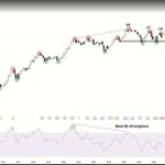
I'm seeing some warning signs in the Nasdaq that suggest we could be heading into a decent correction.
Most people watch the Nasdaq 100, but the problem is that a handful of big tech companies can hide weakness across the rest of the market.
That's why I also watch the equal-weighted Nasdaq (NDXE).
A few things concern me:
1. Bearish RSI divergence, showing momentum is weakening.
2. Multiple failures to break resistance around 10,300–10,400.
3. The September low around 9,800 is critical. If that breaks, the technical picture becomes much more bearish.
Does this mean we're definitely going lower? Of course not.
But trading is about probabilities, not predictions.
Right now, I think the risk of a decent correction is high enough to justify playing defence.
I'll happily turn bullish again when the charts give me confirmation. Until then, protecting capital is my priority.
Remember, you don't need to catch every rally. Sometimes the best trade is simply staying out of trouble.
What do you think? Another leg higher or a bigger correction coming?

MARKETS DON'T CRASH. THEY MEAN REVERT.
One of the most common sayings in investing is "time in the market, not timing the market."
And honestly, I think it's one of the most misleading sayings in investing. It completely ignores valuations, market cycles and the price you're paying for an asset. Whether it's property, equities, precious metals or commodities, they all go through the same process. Markets are forward-looking. Investors price in years of future growth, and during major bull markets, prices can run well ahead of their long-term averages. Eventually, they get too expensive. And what happens next?
MEAN REVERSION.
I've studied markets across multiple asset classes for years, and one thing I've learned is that what people call a "crash" is often just an asset returning towards its long-term average.
It probably should never have reached those extreme prices in the first place.
LOOK AT 100 YEARS OF THE S&P 500
The chart tells an incredible story.
Look at the red circles.
1929, the late 1960s, 2000 and now.
These were periods when US equities were historically expensive, following enormous bull markets. What followed those earlier extremes? Years of disappointing returns, particularly once inflation was taken into account. And here's what people often miss. Markets don't always need a massive sell-off to reset valuations. They can correct sharply, or they can spend 10 to 15 years going sideways while earnings and fundamentals catch up.
Either way, valuations eventually reset.
NOW LOOK AT THE GREEN CIRCLES
These represent periods when valuations were much more attractive.
Think about the early 1930s, the 1940s, the early 1980s and the GFC.
Investors buying around those major valuation lows generally enjoyed much stronger long-term returns.
Same market. Same companies. Completely different starting valuations. That's why I believe the price you pay matters enormously.
WE'VE SEEN THIS EVERYWHERE
Remember the Nasdaq in 2000? It fell nearly 80% from its peak. People called it a crash. I see it as mean reversion. Technology valuations had become completely disconnected from reality. Look at silver's recent run towards $120 and subsequent fall towards $55. Again, people call it a crash. My view? It simply ran too far, too quickly. Even US property during the GFC followed a similar pattern. Land values in many markets had become extremely stretched relative to historical norms, and the subsequent correction helped unwind those excesses. Different assets. Different cycles. Same underlying behaviour.
SO WHAT ABOUT TODAY?
Look at the Shiller P/E ratio on the chart. We're sitting around 41. That's historically expensive. 2nd highest in history. Now ask yourself something. If you had a large amount of capital to invest today, would you rather buy equities when they're historically expensive or when they're historically cheap? It's the same question I'm asking about Australian property. Are we looking at historical buying opportunities, or are we looking at markets where years of future growth have already been priced in?
Warren Buffett built much of his investing philosophy around the idea of a margin of safety. Why shouldn't we apply that same thinking to entire asset classes? I'm not saying markets can't continue higher from expensive valuations. Of course they can. But the more expensive an asset becomes, the more future growth you're paying for today, and the less room you have for things to go wrong. And when the cycle eventually turns, you need to be prepared to weather the storm. Because what the headlines call a crash may simply be the market returning to a more reasonable valuation.
The biggest risk isn't necessarily a market correction. It's paying too much for an asset in the first place.
