

Founder @ https://xitter.cf/t.co/eKypEevtkO | 400+ ecommerce brands | I rebuild the page your ads land on and A/B test it. 10% revenue per visitor or your money back.
See the test results →
Joined July 2021
- Tweets830
- Following372
- Followers265
- Likes3.2K





Pinned Tweet
We built two offer pages for Free the Roots and ran both against their collection page.
Meta traffic, split in ABConvert.
One lost. Revenue per visitor went $1.83 to $1.20. Significantly worse.
The other won. $1.83 to $2.43. +32.88% at 99.52% confidence.
Screenshot is the whole test, both variants, uncropped. Nothing hidden.

Breaking a broad audience up into its parts doesn’t have to be all or nothing. You might see some of the narrow ones come back better and some of them come back worse.
So I’d keep the broad version running wherever it was still the stronger of the two, and go back to the ones that lost another time. You don’t have to pick a side on all of them at once.
A version that wins still has to get signed off by somebody outside the test before it can go live for good, and that part costs real money. So the size of that bill is part of deciding whether the test is worth running at all, because a small win won’t pay for what it costs you to be allowed to keep it.
I’d put the cost in the order it belongs instead. Prove it first, then go and pay for the sign off once the result has earned it. It has to get dealt with at some point either way, so I’m not especially worried about it sitting there until then.
I call it the ghost funnel. Most of the people who go through a paid funnel don’t buy while they’re in it, but plenty of them remember the brand, search for it later and arrive on your ordinary website instead.
So the page that picks them up is the one nobody has been working on, because all of the attention went into the funnel. You can’t stop people going to the website, so you pick things up wherever you can.
I’d still put most of my own time into the funnel. It’s far more scalable and I have much more control over what happens inside it, and the website gets dealt with when it’s in bad shape.
Answer the one thing people keep getting stuck on and a few of them will read your answer and decide they don’t want the product. That looks like the change costing you buyers.
Fair enough on the face of it, because you can see those people leaving and you can’t see what they would have done otherwise. But they were stuck on something real, and now they know where they stand on it.
So I’d count the people it sends away as the page doing what I asked it to do.
I wouldn’t put a brand new offer into a test during your biggest sale of the year, and that isn’t about protecting the revenue.
An offer running in that window can win or lose for reasons that only exist inside it, so when it’s over you still don’t know how it behaves in a normal month, and you have spent one of your test slots finding that out. If you want an answer you can trust, run the test when nothing else is going on.
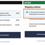
We added one line to Kim C Market’s product page, directly above the add to cart button. It says where the order ships from and how long delivery takes. Before that the page offered you a collection in person and told you nothing at all about when a delivery would arrive.
23 Jan to 11 Feb, 20 days, 4,769 visitors, 2,649 on the original and 2,120 on the new version. Revenue per visitor went from $3.96 to $5.15, so +30.1%, at 98% confidence.
The delivery itself never changed. It leaves the same place in the same time as it always did, and the only difference is that you could see that before you put anything in the cart.

Buy more and pay less works on anything that gets used up, because a cheaper unit price brings forward a decision you were going to make eventually. On something you buy to a measurement there isn’t a decision to bring forward at all. Paying less per unit for more than the job needs is still paying for surplus.
I’d leave one door open on that. Somebody already half thinking about covering a second part of the job might see the unit price drop and do both, and I genuinely don’t know how many people sit there doing that arithmetic.
There’s a second cost to showing it at all. Sooner or later somebody asks you for that price on a smaller order, and now one of your people is having that conversation instead of taking the order.
When a small brand asks what we’d do for them, my honest answer is usually that their problem is a different problem to the one we get hired for. At that size what’s in the way is whether the product has found the people who want it, whether the advertising is any good, and whether the creative is working.
We can do our work on top of all three and there’s only so far it can push. A page does more with the people already arriving on it, and when a brand is that small there often aren’t enough of them arriving yet.
We make listicles, advertorials and comparison reviews in 10 min that don’t look like AI.
funnel-mind.ai/

If the persuading has already happened earlier in the funnel, I’m not sure the product page needs to exist in the way people build it. By the time somebody gets there they know what the thing is and why they want it, so what they need from that page is the price, a bit of reassurance and a way to pay.
The direction matters though. None of that information gets deleted, it gets moved forward to where the person was still deciding.
What you’re left with is a small offer page that is mostly just the buying section. I sell product page work for a living, so I know what I’m arguing myself out of here, and I’d still build it that way on purpose.
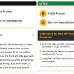
The biggest line on Fresh Guard’s product page used to be the product’s name. We put the promise there instead, and moved the description of what the thing actually does down into the smaller type underneath it.
6 Feb to 17 Feb, 12 days, 6,018 visitors, 3,473 of them on the original and 2,545 on the new version. Revenue per visitor went up 23.1%, and the confidence on that is 96%.
Both versions carried the same promise and both named the product. We only changed which of the two a shopper reads first, and that is a cheaper test than most of what I get asked to build.

If your funnel needs somebody to go away, do something and come back, the order you put that in decides whether they ever do it. Teach them enough to want the thing first. Then ask for the effort, while they’re interested. Then show the price, once they know what they actually need.
Put the effort step at the front and you’re asking a stranger to do you a favour before they want anything.
Hardly anybody buys on the spot anyway. What I want out of that step is the same people still with me at the end of it.
Under the press logos on Sonic Brush’s home page there was a headline and a paragraph about the technology behind the brush. We put that against four small cards with an icon on each, one claim per card. Nothing above or below it changed.
30 Mar to 9 Apr, 11 days, 7,686 visitors, 4,522 on the paragraph and 3,164 on the cards. Revenue per visitor went from $2.01 to $2.75, so +36.8%, at 97% confidence.
Two of those four cards make a claim the paragraph was already making. The other two, dentist approved and soft bristles, it never mentioned. I’d have backed the paragraph going in, because it’s the one that explains how the thing actually works, and I was wrong about that.

When a page has to work for two different kinds of buyer, the version that gets built first puts a choice at the top, so the first thing you do on the page is say which one you are. I’d rather the main button stay an action, so it says what you’re about to do rather than who you are, and the smaller group gets a plain line underneath it that sends them to their own page.
Although if everybody ignoring that line was in the first group anyway, I don’t really know why it’s there. I’ve left it in because somebody clicking it by mistake still lands somewhere that fits them.
Plenty of what I work on sits in a category the buyer already knows inside out, so telling them yours is good does nothing, because every other one in there says that too. What’s left to sell is the way yours works differently. When I believe that explanation myself, I’m the one doing the convincing, and nobody had to sell me anything.
There’s usually one step in a funnel that isn’t part of the work we’ve been brought in for, and now and then the client has built it themselves.
I won’t switch the test on until that step is finished properly, because the traffic goes through it either way. If it’s half built, the number I hand back at the end is partly a measurement of it, and the page we actually tested takes the blame or the credit for something it didn’t do.
So I treat that step as seriously as the page we’re measuring, and I’ll go back and forth with the client on it for as long as it takes to get it right.
If you’re launching into a category nobody knows you for, the product doesn’t have to be on the site for you to find out whether anybody connects with it. Put the page somewhere nobody can stumble on it, send part of your list there, and a flop never reaches the brand.
Somebody showed me a page taking a lot of traffic and converting badly, and I wouldn’t call the page bad on that. I wouldn’t call the traffic bad either.
The channel is probably matching that page correctly, and the people arriving were never relevant in the first place. So a lot of clicks is not evidence that those are your buyers.
I’d want to know who’s turning up before I rebuild anything, because it could be that putting those same people in front of a better page would have made no difference at all.
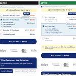
The buy box on Meo Nutrition’s Berberine page used to open with subscription lengths, so the first thing it asked you was how often you wanted it shipped. We put that against a version where the first choice is how many bottles you want, with subscribe and save moved to a tick box underneath.
The test ran 19 days, 11 Sep to 29 Sep, across 6,524 visitors, 3,577 on the old buy box and 2,947 on the new one. Revenue per visitor went from $1.29 to $1.61, which is +24.8% at 99% confidence.
Nothing else on the page moved. Same layout, same copy, same images. I get that it’s the slower way to run a test, but when the offer and the page change at the same time I can never tell a client which half did the work.

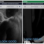
Wick of Hope’s all products collection page opened by naming the product and listing what goes into it. We put that against a version that led with what you get out of it, and changed nothing else on the page.
3 Feb to 13 Feb, 11 days, 2,571 visitors, 1,448 of them on the control and 1,123 on the variant. Revenue per visitor went from $6.00 to $8.33, so +38.8%, and the confidence on that is 97%. The version we took out was accurate and it was thorough, and it lost to one sentence about what you actually get.
