

I design products and websites for startups, from new ideas to improving what exists. Worked with @creativeosHQ @GenPageAI For project inquiries, DM me.
Joined January 2024
- Tweets7.3K
- Following505
- Followers1.7K
- Likes10.3K





I've noticed that asking users for too much information at the beginning can make a product feel like work.
Not everything needs to be collected on the first screen.
Sometimes it's better to let people get started and ask for details when they're actually needed.
3
264


I've noticed that even small changes in a product can affect how people use it.
Moving a button or changing a label might seem minor, but it can make something easier or harder to understand.
That's why I think every design decision should have a reason behind it.
1
4
294
Everyone is using AI tools, skills, and design prompts these days, and most product designs are starting to look similar.
But I think we're missing something important here.
We're not really checking if the experience is simple, if users might get confused, or if there are unnecessary steps.
And more importantly, can we design it differently to make things easier for users?
That's what we should focus on instead of just making another good-looking interface
2
8
429


Aqib retweeted
Big day for us!
After months of hard work, unexpected blockers, and a lot of things that didn't go as planned, we finally made it.
Foldrise is officially live 🥳
Try for free: foldrise.ai/

One thing I've learned about product design is that a clean interface doesn't always mean a simple experience.
A screen might look great, but if users have to think too much about what to do next, there's still a problem.
Making things easy to understand matters just as much as making them look good.
3
6
317
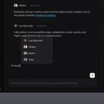
Designed this research screen so teams can review findings with their own notes right beside them


8
402
One thing I pay attention to in product design is what happens when something goes wrong.
A simple error message might tell users there's a problem, but it doesn't always help them fix it.
Showing people what they can do next can make a frustrating experience much easier.
2
255
Big day for us!
After months of hard work, unexpected blockers, and a lot of things that didn't go as planned, we finally made it.
Foldrise is officially live 🥳
Try for free: foldrise.ai/


