

AI Builder|Prompt Engineer|Workflows 🤯原创 GPT-Images / Seedance 视觉案例与提示词 拆解 AI 商用、Agent 自动化|年省百万+人力成本 Build in public|AI, business & fatherhood WeChat: MrLarus
Joined January 2011
- Tweets9K
- Following721
- Followers41.9K
- Likes8.5K




Pinned Tweet
🩶⚔️ She saved her life. Then came the betrayal.
A 52-second AI wuxia short inspired by Dongfang Bubai.
Clashing blades, a silver hairpin, and crimson silk in the rain.
That final smile says it all.
Made with @Flovaai #Flovaai #Flovacpp
Prompts in the replies 👇
🤝 Paid partnership

🎬 A Chinese-style song turned into a full wuxia MV!
White horses, a lost hairpin, a woman in red, broken bridges, deep valleys—
every scene follows the emotion and story of the lyrics.
Built entirely with GPT-AStra + Flova CLI,
with lyric animation powered by the open-source JIZURA project.
Movie made with @Flovaai #Flovaai #Flovacpp
Workflow + breakdown below 👇
📸 Images 2.5 turns torn paper into a time machine!
The fun part is watching everything shift with it—clothes, objects, even the place itself.
1. Ice cream, straight out of 1969
2. Checking into a hotel in 1974
3. Gas pumps turning into EV chargers
4. A record store carrying 1972 into today
One torn edge, and the whole timeline opens up.
Prompt in the replies 👇


🤯 Giant typography makes these fashion covers impossible to ignore!
Low angles, oversized shoes, and vivid color blocking.
1. ZEST: Orange × Cobalt blue
2. BOLD: Checkerboard × Electric purple
3. FLEX: Blush pink × Metallic gold
4. TILT: Mint green × Vermilion
✨ Great for fashion editorials, magazine covers, brand campaigns, and typography inspiration!
Prompt below 👇


Prompt:
【SUBJECT】: {adult woman / man / couple}
【MODERN OUTFIT】: {present-day outfit}
【PAST OUTFIT】: {era-appropriate outfit}
【LOCATION】: {record store / hotel / ice cream shop / gas station / laundromat / etc.}
【PAST YEAR】: {e.g. 1969}
【PRESENT YEAR】: {e.g. 2026}
【MODERN SCENE】: {how the place looks today}
【PAST SCENE】: {how the same place looked in the past}
【KEY PROP】: {optional object}
【ACCENT COLOR】: {main color}
【TITLE】: {short English title}
【TAGLINE】: {short sentence}
【ASPECT RATIO】: 9:16
Create a high-end 9:16 fashion editorial poster built around a single torn-paper time transition. The upper 65–70% of the image is one complete modern color photograph. Only the lower part is torn open, revealing the exact same location in 【PAST YEAR】 as a black-and-white historical photograph. Do not add a second tear at the top.
Make 【SUBJECT】 the absolute visual focus, occupying roughly 70–80% of the frame. Use realistic skin texture, natural hair, believable anatomy, candid body language, and matte fabrics. Avoid oily skin, plastic AI faces, excessive retouching, CGI textures, and stiff model poses. Dress the subject in 【MODERN OUTFIT】 and use 【ACCENT COLOR】 as the main visual color anchor.
Show 【LOCATION】 in 【PRESENT YEAR】 using 【MODERN SCENE】. Keep the environment realistic, contemporary, clean, and visually restrained. Below the single torn edge, reveal 【PAST SCENE】 in black-and-white, preserving the same camera angle, architecture, doorway positions, floor lines, horizon, and perspective so both eras clearly feel like the same place.
Let the torn edge cross the subject around the thigh or knee. Below it, transition the same person into 【PAST OUTFIT】 while keeping exactly the same body position, proportions, leg direction, and weight distribution. If useful, let 【KEY PROP】 also change into its historical equivalent while keeping its position and perspective aligned.
The torn edge should look physically real, with fine white paper fibers, irregular handmade tearing, slight thickness, and a soft contact shadow. Keep the historical section clean and photographic, with subtle black-and-white film grain and natural grayscale. Avoid heavy scratches, stains, yellowing, distressed paper, glowing cracks, portals, floating fragments, or fantasy effects.
Use natural daylight or believable indoor light. The modern section should feel clean, tactile, and editorial rather than overly cinematic or commercial. Keep the person sharper than the background, with realistic skin, fabric, object materials, and depth of field.
Add restrained editorial typography: “TIME IN BETWEEN” with “【PAST YEAR】 / 【PRESENT YEAR】” near the top, then “【TITLE】” and “【TAGLINE】” in the lower historical area. Keep typography secondary to the person. Do not add random text, logos, watermarks, QR codes, or decorative symbols.
The final visual hierarchy should be: first the person and outfit, then the single torn edge, then the discovery that the same person, object, and location continue into an earlier era underneath. Generate one complete standalone 9:16 poster, not a split-screen, grid, or before/after layout.
Prompt:
1/5 — Characters & style
Create a photorealistic, cinematic magic-academy romance. Harry: messy black hair, round glasses, burgundy-trimmed robes. Female Malfoy: platinum-blonde half-up hair, green-trimmed robes, silver accessories. Keep faces, outfits, and props consistent across shots. Natural expressions, realistic hair movement, weighted fabric, atmospheric lighting. Vertical 9:16, 720p, Seedance 2.5. Generate short scenes separately. English dialogue where needed; otherwise use ambient sound and effects. Add music during editing.
2/5 — An unexpected fall
Inside a dim Gothic academy, Harry climbs a long stone staircase carrying a large worn leather suitcase. Malfoy and her two friends approach from above. They notice him while walking. Close-up: the short-haired friend subtly casts a spell. Cut to the stone step cracking beneath Harry’s approaching foot. His weight lands on the damaged edge; it collapses. He stumbles forward, drops his suitcase, and catches himself on his left hand. Books scatter down the steps. Low-angle shot: the three girls loom above him. Malfoy looks down with restrained amusement.
3/5 — Forced partners
In class, Harry examines his injured hand. Malfoy notices, then looks away. The teacher calls: “Potter. Malfoy. Together.”
During a magical exercise, Malfoy holds a shimmering shield against the teacher’s attack. Alternate close-ups of focused eyes, gripping hands, and rippling magic. The teacher intensifies the spell; his hair and robes surge in the magical wind as a flock of dark ravens sweeps forward. Malfoy braces with both hands but loses her footing. Harry catches her with his right arm, then visibly extends his left arm to counter the attack. Her expression shifts as she watches him protect her.
4/5 — Jealousy, danger & rescue
In a sunlit courtyard, Harry shares a small floating golden light with another girl. She gently checks his injured wrist. From the cloister, Malfoy notices their closeness; her expression tightens almost imperceptibly.
Later, high in a moonlit forest, Malfoy confronts a snarling, amber-eyed beast on an enormous branch. Her spell strikes it with a visible burst of force. A second creature ambushes her, knocking her into the ravine. Harry dives toward her on a flying broom, intercepts her fall, and catches her in a clear bridal carry: one arm supporting her upper back, the other beneath both knees. Their momentum carries them forward before they climb away.
5/5 — The moment everything changes
During a quieter flight, maintain the bridal carry throughout. Malfoy looks up at Harry, realizes how close they are, and lowers her eyes. Close-up: her fingers gently tighten around his robe. Wind moves individual strands of hair and softly lifts their clothing.
Cut to her dormitory entrance at night. Harry naturally turns and walks away along the stone path. Malfoy takes a few steps toward the warm doorway, slows, then looks back. Over her shoulder, show him several metres away, still walking. Close-up: her gaze softens, a tiny smile appears, and she lowers her eyes before turning inside. Keep his expression ordinary and relaxed; let her reaction reveal the growing feelings.

Prompt:
Create a cinematic live-action wuxia sequence inspired by Dongfang Bubai and classic Hong Kong martial arts cinema. Approximately 52 seconds, 16:9, 720p.
SETTING AND CHARACTERS
A rain-soaked wooden pavilion beside a misty mountain lake at night. Warm amber lanterns illuminate wet timber, wooden pillars, open railings and flowing red curtains. Cool blue mountains and lake water remain visible beyond the pavilion. Maintain consistent geography throughout.
Dongfang Bubai wears flowing crimson robes, with long black hair and a silver Chinese straight sword. Her movements are precise, swift and commanding. A black-clad male swordsman carries his own straight sword. A young woman in ivory robes wears a slender silver hairpin that she later uses as a concealed weapon. Keep their faces, costumes, weapons and proportions consistent.
OPENING — THE INTERVENTION
The ivory-robed woman stands near a red curtain as the black-clad swordsman advances with his blade. Dongfang Bubai sweeps between them, crimson sleeves trailing behind her, and intercepts his sword with her own.
Begin with a medium shot establishing all three characters, then track into a three-quarter combat angle as the blades collide. Dongfang Bubai immediately counters toward his upper body. He parries and returns the attack, carrying the movement directly into a rapid duel.
THE DUEL
The swordsman attacks with a diagonal cut, a returning slash and a direct thrust. Dongfang Bubai redirects the strikes while advancing, her footwork and sword moving together. Each parry opens the next attack; both fighters continually adjust distance and balance.
Use moving medium-wide shots to show their full bodies and the path of the blades. Cut closer for a forceful blade collision, then return wide as they change position across the wet pavilion.
When his sword is knocked aside, the swordsman snaps a small concealed dart toward her with his free hand. Dongfang Bubai slips outside its path and immediately closes the distance. Their swords clash overhead. She turns his blade outward and drives a counterattack through his exposed guard, forcing him backward into the lakeside railing.
His momentum carries him over the edge. Cut to an exterior wide shot as he falls into the lake, followed by a violent splash.
THE BETRAYAL
Cut from the splash to a close-up of the ivory-robed woman. A passing crimson sleeve clears the foreground. Her startled expression tightens; her eyes settle on Dongfang Bubai with deliberate intent.
Cut to a side two-shot. Standing slightly behind her rescuer, she pulls the slender silver hairpin from her hair and drives its point toward the side of Dongfang Bubai’s neck.
Dongfang Bubai catches the movement, leans away from the point and seizes the attacking wrist. The stab flows directly into a close struggle. The woman pulls forward and twists her arm, while Dongfang Bubai turns her wrist outward and keeps the hairpin away from both bodies. Show the weapon continuously from its removal through the interception.
THE SWORDSMAN RETURNS
Close-up: a wet hand grips the edge of the pavilion. The black-clad swordsman hauls himself out of the lake, sword still in hand, and immediately surges toward them.
Cut wide to establish the three-person arrangement. Dongfang Bubai is caught between the returning swordsman and the ivory-robed woman. The woman pulls against the captured wrist and attacks again as the swordsman closes from the other side.
Dongfang Bubai pivots through the narrowing gap, redirects the woman’s weapon arm and meets the swordsman’s attack. Track around the confrontation to reveal the successive threats while preserving the positions of the lake, railing and pillars. The woman and swordsman press their attacks together, forcing Dongfang Bubai to respond continuously.
SAVING HER AGAIN
A tight shot catches the swordsman committing to a fast horizontal cut. Cut across his shoulder to reveal that the ivory-robed woman has moved into his blade’s path.
Dongfang Bubai immediately shoves her clear. The swordsman takes the opening and redirects his next thrust toward Dongfang Bubai’s exposed upper body.
Cut to a low side angle as Dongfang Bubai drops into a deep backbend beneath the passing blade. Her left palm plants firmly on the wet floor. Using that hand and her grounded foot for support, she drives her other leg upward into the swordsman’s torso, knocking him backward.
Follow the movement in a wider shot as she pushes off the supporting hand and flips back onto her feet. Her crimson robes whip through the recovery, and her landing flows directly into the counterattack.
THE FLYING SWORD
Dongfang Bubai drives her sword forward and releases it toward the retreating swordsman.
Cut on the release to the swordsman beside a wooden pillar. The blade strikes his shoulder area, throwing him back against the timber. His sword arm drops. He grips the wound and slides down the pillar into a seated position on the wet floor. Connect the release, impact and collapse in a sharp, readable sequence.
THE SILVER HAIRPIN
Close-up of the ivory-robed woman with the open lake and misty mountains behind her. She looks toward the wounded swordsman, then snaps her gaze toward Dongfang Bubai. Her expression hardens.
She grips the silver hairpin, draws her arm back and throws it toward Dongfang Bubai in one decisive motion. Cut from the release to the approaching threat.
CRIMSON SILK
Dongfang Bubai now has both hands free. She flicks her arms outward, sending two long strips of crimson silk from her sleeves.
The flying hairpin pierces the leading layer of silk. She immediately crosses and turns her wrists, drawing the two strips through a flowing circular motion. The silk folds around the hairpin’s path, absorbs its forward momentum and redirects it.
Use a medium shot to establish her hand movements, a brief close-up of the silver point piercing the red fabric, then a wider moving angle as she completes the turn. Her final outward sweep releases the hairpin toward a nearby wooden pillar. Cut close as it strikes the timber and remains embedded.
THE FINAL CONFRONTATION
The ivory-robed woman immediately steps back into striking distance. Dongfang Bubai closes the gap with the red silk still moving.
In a medium side shot, she loops the silk around the woman’s attacking forearm, steps across her line and draws the fabric taut. The turn breaks the woman’s balance and pulls her down into a low, restrained position.
Cut closer as the woman pulls against the restraint, then lifts her eyes toward Dongfang Bubai. Her brows tighten and her lips press together. Her expression combines wounded pride, irritation and a defiant, almost petulant tenderness, suggesting a relationship more complicated than simple hatred.
Finish on her upward gaze, with taut crimson silk across the foreground and the rain-dark lake behind her. Leave the meaning of that look unresolved.
CAMERA, RHYTHM AND SOUND
Use energetic third-person combat framing, dynamic tracking, low-angle action views, over-the-shoulder threat reveals and selective close-ups of eyes, hands and weapon contact. Change angles at meaningful reversals, cutting on movement so every shot continues the momentum of the previous one.
Play the combat at normal speed with sharp acceleration, committed attacks, convincing weight and immediate consequences. Keep full-body action readable during complex movements. Let sleeves, hair, rain and splashing footsteps reinforce the direction and force of each action. Reserve the brief emotional emphasis for the woman’s changing gaze and the final close-up.
Sound consists of rainfall, wet footsteps, breathing, sword clashes, blade swishes, fabric snaps, the lake splash and the hairpin striking wood. No background music, dialogue, narration, subtitles or on-screen text.

🤯 用 Images 2.5 做海报怎么更有新意?压角构图还能这么玩!
四角负责压住版面,再让流体、拉力和振动打破秩序,视觉一下就活了✨
1. 热融成形:材料熔化,字形随之变化
2. 张力成形:四角拉索,撑开柔性结构
3. 墨水生形:墨云扩散,形成反向张力
4. 声场成纹:黑砂振动,让声音长出纹样
🌟很适合做实验海报、编辑设计和艺术视觉参考!
Prompt below 👇


提示词:
【主题】
【四字中文标题】
【主视觉材质】流体 / 柔性膜 / 熔融材料 / 颗粒 / 其他动态材料
【物理变化】扩散 / 拉伸 / 熔化 / 振动 / 聚集 / 流动
【背景主色】
【字体主色】
【强调色】
【英文标题】
【画面比例】9:16
生成一张具有 **East Asian Contemporary Exhibition Poster、Japanese Experimental Graphic Design、Editorial Art Direction、Corner-Pressure Composition** 气质的实验性竖版海报。核心使用“压角构图”:将【四字中文标题】拆成四个巨大汉字,从左上、右上、左下、右下向画面中心强势压入。四字不要等大、等距或形成四宫格,而是通过不同字号、裁切、出血量和进入中央的深度建立明显的向内压力。
画面中央设置一个体量足够大的【主视觉材质】,并通过【物理变化】形成与四角 Typography 相反或互相作用的视觉势能。重点不是“主体放在文字中间”,而是让材料本身真正参与版式:流体可以向外扩散并遮挡部分笔画;柔性膜可以被四角拉力撑开形成空间结构;熔融材料可以从固态逐渐软化、下坠并改变后方文字的视觉状态;颗粒可以因振动或物理作用自动聚集成具有规律的纹样。每张作品只选择一种最强的物理机制,避免同时堆叠过多特效。
主体必须具有真实、可信的材料属性和物理逻辑。例如流体需要有连续的浓度、卷吸和扩散关系;柔性材料需要有真实受力点、拉伸纹理、褶皱和接触阴影;熔融材料需要体现从固态、软化到流动的连续状态变化;颗粒必须具有真实粒径、密度变化、堆积与散落,而不是数字粒子特效。让观众明确感受到“材料正在运动、变形或响应外力”,而不是普通 3D 抽象造型。
Typography 分为三个层级:四角巨大中文字负责第一视觉;【英文标题】和中文作品名负责第二层;日期、地点、短句、材料关键词和少量说明负责第三层。使用明显字号反差、不对称对齐、局部竖排中文、紧凑英文和极细分隔线建立成熟的编辑设计感。信息密度保持中高,但不要平均铺满画面,应围绕主体形成局部密集区域,同时保留一部分干净负空间。
整体色彩控制在 3–4 个主要层级。【背景主色】作为大面积色域,【字体主色】建立稳定结构,【主视觉材质】承担最主要的形态与质感,【强调色】只用于极少量短线、日期节点、受力点或编辑标记。可以加入极轻纸张纹理、丝网印刷网点、胶印颗粒和局部套印感,但整体必须保持现代、干净、高级。
图文互动至少形成 2–3 处明确关系,例如主体从巨大字形前后穿过、在高密度区域使用反白文字、流体沿字形方向延伸、颗粒靠近笔画聚集、柔性材料真实遮挡部分汉字,或透明/半透明材料让后方文字产生自然视觉变化。所有互动都必须合理、可理解,并保证四个核心汉字仍然可辨认。
最终阅读顺序应为:第一眼看到四角巨字与中央动态主体形成的强烈大形;第二眼发现材料正在扩散、拉伸、熔化或振动;第三眼理解真实物理现象如何改变 Typography 和版面;最后阅读英文标题与少量展览信息。缩略图状态下必须具备明确焦点、强色彩对比和 Stop-scroll 冲击,放大后又能看到材料细节与精密编辑排版。
避免:机械四宫格、四字完全等大、主体过小、材料与字体彼此分离、普通抽象 3D Blob、液态金属滥用、数字粒子、随机烟雾、RGB glitch、赛博朋克、科技 HUD、复杂参数、无意义英文、Logo、二维码、编号、四角星芒和版权标识。
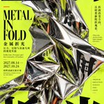
📐 用 Images 2.5 做海报怎么更有冲击力?压角构图真的很好用!
四角巨字压住画面,再让真实材质改变字体,版面马上就有张力✨
1. 金属折光:镜面折射,重组巨字
2. 重力成痕:巨石下压,带动字形变形
3. 镜裂成像:裂片分割,改变文字反射
4. 裂冰成字:冰体穿字,用裂纹打破平面
🌟很适合做展览海报、编辑设计和实验视觉参考!
Prompt below 👇


提示词:
【主题】
【四字中文标题】
【主视觉材质】金属 / 石材 / 镜面 / 冰体 / 其他硬质材料
【物理变化】折叠 / 下压 / 破裂 / 折射 / 形变
【背景主色】
【字体主色】
【强调色】
【英文标题】
【画面比例】9:16
生成一张具有 **East Asian Contemporary Exhibition Poster、Japanese Experimental Graphic Design、Editorial Art Direction、Corner-Pressure Composition** 气质的实验性竖版海报。核心使用“压角构图”:将【四字中文标题】拆成四个巨大汉字,从左上、右上、左下、右下向画面中心强势压入。四字不要等大、等距或形成四宫格,而是通过不同字号、裁切、出血量和进入中央的深度建立明显的向内压力。
画面中央设置一个体量足够大的【主视觉材质】,并通过【物理变化】真实改变版面。重点不是“把物体放在四个字中间”,而是让材质真正与 Typography 发生关系:镜面可以反射、切分并重组字形;重物可以压低纸面,让文字跟随表面产生真实透视变化;破裂材质可以通过裂片改变文字反射方向;透明冰体可以遮挡、折射并穿过部分笔画。每张作品只选择一种最强的物理机制,不要同时堆叠大量特效。
主体必须具有高度真实的材质细节,例如镜面金属的折面与倒影、石材的重量和颗粒、玻璃或冰的厚度与折射、纸面的凹陷褶皱、裂纹边缘和接触阴影。物理关系必须合理可理解,让观众明确看到“真实材料正在改变字体和版面”,而不是后期数字扭曲、随机 glitch 或普通 3D 装饰。
Typography 分为三个层级:四角巨大中文字负责第一视觉;【英文标题】和中文作品名负责第二层;日期、地点、短句、材料关键词和少量说明负责第三层。使用明显的字号反差、不对称对齐、局部竖排中文、紧凑英文和极细分隔线建立成熟的编辑设计感。信息密度保持中高,但不要平均填满画面,主体附近可以更密,另一部分保留干净负空间。
整体色彩控制在 3–4 个主要层级。【背景主色】形成大面积强色域,【字体主色】建立稳定结构,【主视觉材质】负责真实物理质感,【强调色】只用于少量短线、日期节点或编辑标记。可以加入极轻纸张纹理、胶印颗粒和丝网印刷质感,但不要严重做旧、污渍或朋克拼贴。
最终阅读顺序应为:第一眼看到四角巨字与中央硬质主体形成的强烈大形;第二眼发现材质真的改变了 Typography;第三眼观察反射、压力、裂纹、折射或表面形变;最后阅读英文标题和少量展览信息。缩略图状态下必须有清晰焦点和强烈 Stop-scroll 冲击,放大后又有真实材质和精密排版细节。
避免:机械四宫格、四字完全等大、主体过小、字体和材质彼此分离、普通产品广告、随机数字扭曲、RGB glitch、科技 HUD、复杂参数、Logo、二维码、编号、四角星芒和版权标识。
🤯 Images 2.5 把克里姆特风油画做成展览海报,太抓眼了!
枝叶、羽纹、花卉沿着衣褶延伸,巨字体现展览海报感:
1. 银白冬枝:银白 × 黑色枝条
2. 墨羽鎏光:黑金 × 孔雀羽纹
3. 紫暮花笺:烟紫 × 鸢尾花
4. 琥珀秋声:暖橙 × 麦穗纹样
🌟很适合文化展览、服饰视觉和系列海报设计参考!
提示词在评论区👇


提示词:
展览名称:【中文展名】
英文展名:【英文名称】
人物设定:【成年人物的外貌、发型、表情与姿态】
服饰与动作:【衣裙款式、衣料走向、手部动作,可不出现手】
主色调:【服饰主色+背景色】
装饰纹样:【枝条、羽纹、花卉、麦穗或自定义图案】
文字颜色:【深黑/米白】
展讯:【副标题、展览日期、场馆、开放时间】
设计一张9:16竖版艺术展览海报,融合克里姆特风格的装饰绘画与日式美术馆编辑排版。让服饰和背景通过纹样连接,人物面部保留油画体积,巨型中文标题直接参与构图。
以原创成年人物半身肖像作为主视觉,大幅裁切部分头发、肩部与衣袖。面孔位于上半部,根据人物朝向安排偏左或偏右构图。利用肩背、披肩或宽袖形成一个明确的大形,建立斜向、弧形或纵向的画面动势。若出现手部,确保手指、手腕、前臂连接自然,动作简洁,不被标题遮挡。
面部以赭石、灰粉、冷灰与暗红的小块油画笔触塑造,颜色随骨骼转折变化,保留底色露出和虚实边缘。面部与手部笔触较细,头发、衣料、背景更自由。避免摄影磨皮、光滑数字渐变,以及整张图覆盖同一种厚涂纹理。
服饰以所填主色形成宽阔、连贯的色块,用少量衣褶交代身体与织物的体积,其余区域逐渐转为平面装饰。让所填纹样顺着肩背、衣袖、披肩弧度或衣褶方向展开,局部越过衣服轮廓,延伸进背景,使人物与环境属于同一幅绘画。
纹样有主次、大小与疏密变化,避免等距重复。面孔和手部附近保持安静,袖部、肩背与画幅边缘可以更丰富。植物、羽毛等元素需转化为平面图案,避免变成手持道具或真实物件堆叠。
以哑金、黄赭、米白、暗铜或黑褐色组织装饰细节,保留颜料叠压、刷痕与细微印刷颗粒。金色面积服从主色调,不让每张都变成满版金底。浅色主题使用深色枝线与黑字,深色主题使用米白文字,并保留衣料暗部层次。避免镜面金属、立体浮雕、珠宝镶嵌和发光特效。
将中文展名设计成修长、粗细对比明显的宋体或明朝体巨字。根据人物与衣料的大形,采用沿边纵排、横竖错落或局部横跨的编排,文字直接叠印绘画,不放进独立标题框。保护面孔、手部与关键动作,主要字形完整准确,复杂汉字不拆分、不拼接、不变形。
顶部以细长英文字体排列英文展名。底部直接叠印展讯,以醒目日期、中型场馆名称、紧密小型说明构成三级尺度。文字组共享清楚的对齐线,落在相对安静的绘画区域,不设置独立色块底栏。所有展讯完整留在画幅内,保留安全边距。
整体呈现艺术作品复制图与成熟展览排版相结合的观感。缩小观看时,面孔、服饰主色块和巨字清楚;放大后可见笔触、织物纹样与展讯细节。系列中统一绘画语言、字体气质和展讯格式,通过人物姿态、明暗、纹样与衣料方向产生变化。
只输出单张满版平面海报,仅使用填写的文字。不要添加随机外文、虚构赞助商、编号、四角星芒、水印、画框、墙面或展示样机。
🤯 Images 2.5 做克里姆特风海报,油画笔触和巨字排版太搭了!
金色纹样铺满衣裙与背景,巨型汉字直接压进画里:
1. 绯色回响:绯红衣裙与金色螺旋
2. 金色凝视:暖金纹样与肖像特写
3. 蓝夜微光:深蓝衣裙与金色织纹
4. 翠影流金:孔雀绿与银杏叶
🌟很适合艺术展海报、图录封面和装饰绘画设计参考!
提示词在评论区👇


提示词:
展览名称:【填写展名】
人物与姿态:【成年人物的外貌、发型、服饰与姿态】
主色调:【主色+辅助色】
装饰纹样:【植物、几何、螺旋或其他主题纹样】
英文展名:【填写英文名称】
副标题:【填写展览主题】
展览日期:【填写日期】
展览地点:【填写场馆】
设计一张9:16竖版艺术展览海报,将克里姆特风格的装饰油画与日式美术馆编辑排版结合。只输出单张满版平面海报。
以原创成年人物半身肖像为主体,大幅放大并裁切头发、肩部与衣裙,让面孔在上半部形成清晰焦点。根据姿态安排偏左或偏右构图,为巨型标题留出空间。五官与颈肩结构自然,表情具有个性。
面部通过赭石、灰粉、暗红与冷灰色的小块油画笔触塑造,保留冷暖交错、底色露出和边缘虚实。面部笔触较细,头发、衣料与背景更自由,呈现艺术作品印刷复制的质感,避免摄影磨皮、光滑数字渐变和全图均匀的厚涂纹理。
服饰以所填主色形成宽阔、明确的大色块,少量衣褶交代体积,其余区域逐渐转为平面装饰。让所填纹样顺着肩背、衣袖或衣褶延伸,局部跨越人物轮廓,与背景融为一体。纹样大小错落、疏密有变化,面孔附近安静,衣裙与边缘区域丰富。
以黄赭、米黄、暗铜和黑褐色绘制哑金装饰,保留色层与细微颗粒。金色面积根据主色调调整:暖金主题可以满版,深蓝、绿色或绯红主题则保留集中色块。避免镜面金属、珠宝与立体浮雕效果。
将中文展名设计成具有构图作用的巨型文字,采用修长、粗细对比明显的明朝体或宋体。根据人物位置,选择沿边纵排或横竖错落的布局,直接叠印在头发、衣裙和背景上。允许少量非关键笔画贴边裁切,但主要字形完整、准确可辨,不遮挡眼睛、鼻子和嘴部。文字颜色以米白或深黑为主,与背景形成强烈明暗对比。
顶部排列细长的英文展名,底部直接叠印副标题、日期和场馆。建立巨型中文、中型日期、紧密小型展讯三个尺度,文字组共享清楚的对齐线,不另设独立底栏。保持丰富的展讯密度,同时确保文字清晰、日期与场馆完整处于画幅内。
整体让人物面部的体积、服饰背景的平面纹样与巨字排版相互配合。缩小观看时,仍能立刻识别面孔、主色块与展名。
仅使用填写的文字,不添加随机外文、虚构赞助商、编号、四角星芒、水印、画框或展示样机。若提供参考图,吸收其笔触、字体比例与信息密度,重新创作人物和纹样。
🤯 Pasta weaving through giant letters looks insanely good!
Food curls in front of and behind the type.
1. Basil Pesto: green ribbons
2. Tomato Basil: red sauce
3. Beetroot Ravioli: pink parcels
4. Squid Ink: black spaghetti
🍝 Perfect for food branding, menus, and editorial posters!
Prompts in the replies 👇


🍽️ Images2.5 turns food physics into typography!
This set gets even better when the food starts cutting, pushing, and building the letters.
1. Salmon slices the type
2. Cheddar pushes letters apart
3. Meringue builds the type
4. Waffle grids reshape the letters
🌟Great for food branding, editorial posters, campaigns, and social visuals.
Prompt 👇


Prompt:
Create a premium 9:16 Food × Typography editorial poster.
Food: [YOUR DISH]
Headline: [GIANT TEXT]
Colors: [COLOR PALETTE]
Ingredients: [KEY INGREDIENTS]
Combine photorealistic commercial food photography with enormous Didone/Bodoni-style serif typography.
Make the food weave through, wrap around, and overlap the giant letters, alternating naturally between foreground and background to create convincing 3D depth.
Use realistic food textures, appetizing highlights, natural ingredient movement, and elegant studio lighting.
Add refined magazine-style typography, an italic dish name, meaningful ingredient descriptions, small editorial labels, and carefully balanced negative space.
Warm ivory background, bold visual hierarchy, rich but controlled colors, premium Italian food advertising aesthetic.
Keep the headline readable and the food physically realistic.
Ultra-detailed, sophisticated, print-ready, vertical 9:16.
No watermarks, random logos, meaningless text, or cartoonish rendering.
🤯 用 Images 2.5 做日式复古手绘海报,大形体 + 小世界真的很出效果!
把滚筒、纸鸢、胶片和电车直接变成画面的视觉骨架:
1. 一车春天:复古电车穿过山海与花田
2. 风从纸上来:巨型纸鸢拉出整条海边路线
3. 海风放映中:电影胶片串起四段夏夜故事
4. 印一座城:滚筒把街巷慢慢“印”出来
🌟 很适合文化节、城市文旅、展览和品牌活动视觉参考!
通用提示词在评论区👇


提示词:
【海报主题】:{填写主题}
【中文主标题】:{填写标题}
【英文标题】:{填写英文名称}
【核心视觉创意】:{一个强主体 + 一个明确的视觉关系,例如:电车穿过山海、纸鸢牵出海岸路线、胶片串联不同场景、滚筒印出城市}
【主要画面元素】:{人物、建筑、自然、器物等}
【主色调】:{2–3种主色 + 1种强调色}
【活动日期】:{填写日期}
【活动地点】:{填写地点}
【活动内容】:{填写活动项目}
【画幅比例】:9:16
创作一张具有东亚复古手绘美学的文化活动艺术海报,融合日本与台湾地区独立文化展览海报、复古绘本插画、传统平面印刷和实验性编辑设计语言。
围绕【核心视觉创意】建立一个清晰、完整的大型视觉骨架。
不要只是把多个漂亮元素堆放在一起,而要让主体真正参与构图:可以让物件转化成道路、城市或自然场景,也可以通过连续曲线、尺度变化、穿插、围合等方式串联整个画面。
远看首先看到一个醒目的大形体和明确的视觉概念,近看再逐渐发现人物、建筑和生活细节。
采用自由、不完全规整的手绘墨线,结合二维平面设色与局部精细线描。建筑、树木、人物和器物允许轻微夸张、不对称和自然的手绘稚拙感,避免过度机械与标准化。以暖象牙米白纸张为底,搭配草木绿、湖水青、朱砂红、陶土橙、芥末黄、深靛蓝、炭黑等复古自然色。
每张海报控制颜色数量,以一种高识别度强调色建立视觉焦点。颜色保持完整、饱满、平涂,只保留轻微纸张和传统印刷质感,避免厚重做旧与随机颗粒。
主体区域可以拥有丰富的小故事,但细节必须围绕主题展开。人物动作自然,场景具有生活感,外围主动留白,保持“局部丰富、整体清楚”。
中文主标题使用大胆、有手绘笔触的字体,可以错落排列、压角、围合,或与主体产生局部穿插。英文标题、日期、地点和活动信息使用更克制的编辑字体,通过不同字号、横竖排、细线和留白建立清晰层级。文字必须参与构图,而不是简单覆盖在插画上;所有内容具有真实意义,避免随机日文、乱码、假英文和无意义装饰。
整体呈现成熟独立插画师创作的文化活动海报气质:大形先成立,细节再丰富;视觉关系明确,故事内容克制;手绘自然但不粗糙;色彩复古但不灰暗;排版丰富但保持呼吸感。
同系列作品保持统一的纸张、笔触、色彩品质和编辑美学,但每个主题都重新设计主体、空间关系与构图方式,不要机械复制上一张的结构。
避免普通儿童卡通、3D微缩模型、CG渲染、摄影写实、复杂渐变、过度做旧、强颗粒、无意义元素堆叠、四角星芒和模板化排版。
最终输出一张完整、精致、具有收藏感的9:16高清文化艺术海报。
🤯 用 Images 2.5 做图文结合海报,四角构图让视觉冲击拉满!
让主体真的进入字形、改变版式,画面一下就有了张力:
1. 透明错觉:玻璃折射,让字形真的发生位移
2. 磁力显形:磁流体 × 铁粉,把不可见的力变成构图
3. 夜行图鉴:巨大翅膀穿插文字,让主体成为版式
4. 植物越界:花、叶和根系穿过笔画,打破文字边界
🌟很适合做展览海报、编辑设计、文化视觉和实验平面设计参考!
Prompt below 👇


提示词:
【主题】
【四字中文标题】
【主视觉主体】
【主体 × 字体互动方式】穿插 / 遮挡 / 折射 / 穿越 / 变形 / 材质融合
【背景主色】
【字体主色】
【强调色】
【英文标题】
【展览信息】
【画面比例】9:16
生成一张具有 **East Asian Contemporary Exhibition Poster、Japanese Experimental Graphic Design、Editorial Art Direction、Four-Corner Typographic Composition** 气质的当代实验海报。
核心采用“四角巨字构图”:将【四字中文标题】拆成四个巨大汉字,分别作为左上、右上、左下、右下的视觉锚点。四个字不要机械等大、等距或形成四宫格,应通过不同字号、裁切、出血、字重和位置建立不对称但稳定的版面张力。
画面中央设置一个具有强视觉识别度的【主视觉主体】,主体必须足够大,并真正参与 Typography,而不是简单放在四个字中间。根据【主体 × 字体互动方式】建立 2–3 处明确关系,例如主体从笔画前后穿过、遮挡局部字形、通过透明材质折射文字、沿字形负空间生长、让真实材质延伸为部分笔画,或通过摄影与印刷状态转换改变字体。所有互动都要“意外但合理”,同时保证汉字仍然可以辨认。
每张作品只选择一种最强的视觉机制作为核心,不要同时堆叠折射、流体、穿透、颗粒、透明和复杂特效。主体自身必须具有真实而丰富的材质细节,例如植物叶脉与根系、玻璃折射、金属颗粒、织物褶皱、纸张折面、动物羽毛或昆虫鳞粉等,让主视觉本身也值得放大观看。
Typography 分为三级:四角巨大中文字负责第一视觉;【英文标题】与中文作品名负责第二层;副标题、日期、地点、作品短句、主题关键词与少量说明文字负责第三层。使用明显的字号反差、横排与竖排变化、不对称对齐、细线与紧凑字距建立成熟的编辑设计感。信息密度保持中高,但不要平均填满画面,应形成“局部密集 × 局部安静”的节奏。
整体使用【背景主色】作为大面积色域,【字体主色】建立稳定结构,【强调色】只用于主体、细线、日期或极少量印刷标记。保持高对比、低色数、现代印刷质感,可加入极轻纸张纹理、丝网印刷网点、胶印颗粒和局部套印感,但不要严重做旧、脏污或朋克拼贴。
最终阅读顺序应为:第一眼看到四角巨大汉字与主体形成的强大形;第二眼发现主体真的改变、穿越或参与了字体结构;第三眼观察真实材质、遮挡、折射或空间关系;最后阅读【英文标题】与少量展览信息。
整体作品应像真实的当代艺术展览海报、实验平面设计年鉴、文化视觉或独立艺术出版物,而不是普通“主体图片 + 四角文字”的模板。
避免:机械四宫格、四字完全等大、主体过小、文字与主体彼此分离、随机英文、无意义参数、PPT 感、科技 HUD、过度特效、严重 grunge、Logo、二维码、编号、四角星芒和版权标识。