

Type and printing museum, Italian type design archive & letterpress workshop
Cornuda (TV)
Joined July 2014
- Tweets322
- Following367
- Followers1.3K
- Likes2.6K



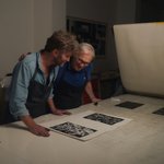
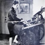

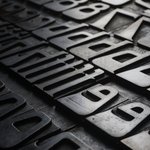
In his article “Storia ed estetica del carattere”, (Graphicus, 1952) Alessandro Butti shows some typefaces. It’s interesting to envision the choices of a typedesigner.


We're launching the 4th edition of TipoItalia, the study and research seminar about lettering and typefaces that will take place in Tipoteca from June 22–July 3, 2026.
All info available at tipoitalia.net
#typography #typedesign #lettering


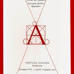
Until June 28, in Tipoteca you can visit the exhibition “Tallone Editore. La forma del pensiero”. Tallone is one of the last master printers, who brings out the spirit of the texts through typographic means alone and giving the aesthetics of the page a rich essentiality.


Who can help us to find excerpts from books by writers or poets (not by designers or scholars), that mention the work and the people in printshops? To give you an idea: the opening of Balzac in “Lost Illusions”. A great ‘photograph’ of that time.
#typography #writers #books

Sabato 1 febbraio, ore 17. Inaugura la mostra “Sogno, memoria, materia” sulla Stamperia d'arte Albicocco di Udine. Da non perdere, per riconoscenza verso la maestria di questi maestri stampatori…


We never stop learning and it is always important to read about topics we take for granted and are familiar with. Of course, everybody recognizes a Garamond, but...

Read about Garamond, the typeface that had a complicated history before appearing in the 20th century as the book typeface par excellence and being repeatedly reinterpreted.
➽ typofonderie.com/gazette/gar…
By Michel Wlassikoff

A very nice project going on here! Let's make it happen.

A beautiful book featuring the treasures of the Type Archive’s collections is in the works.
‘Type Archived’ traces the origins of typography through the physical tools, objects and machinery that made the printed word possible.
Pledge for your copy
tinyurl.com/mry4nvdt

On Sat October 26, 5pm, opening in Tipoteca of the exhibition “Olivetti. Storie da una collezione”, curated by Giorgio Cedolin and co-organized with Ronzani Editore.

Finally the Alfabeti Modernisti series is out. Give a look!
Thanks @castfoundry
c-a-s-t.com/alfabeti-moderni…
Let's dress up the world with some letters.
The Making of The Mary Quant Mural youtu.be/26bcbxE1EDQ?si=j1-V… via @YouTube
Great presentation about the early times of digital type design.

Last week I did a talk for Type Tuesday in Minneapolis where I did a live demo of early font editors on a real Macintosh Plus. I've uploaded a video recording of it here: youtu.be/Cqbnocp7j_A

We have something to do with the only copy of this book, shown at the beginning in the video.
Handmade with a Japanese binding...
instagram.com/reel/C7j3qQHN2…


A place to visit: Villaggio Eni, Borca di Cadore. Architect Edoardo Gellner and, in some parts, Carlo Scarpa. #villaggioeni


HEI [Hand & Eye Intelligence]

Sign-writers at work
Original image from Public Record Office Victoria
flickr.com/photos/public-rec…

Tipoteca Italiana retweeted

Barilla: Real Egg Pasta, 1958 designed by Erberto Carboni. Image via @agigraphic
Subscribe to my newsletter for more design history designreviewed.com/newslette…


