

Product designer. I treat AI as a studio, not a slot machine. Building VISUAL OS — an open system of 170+ visual styles ↓ [email protected]
Between design & AI
Joined August 2025
- Tweets5.3K
- Following762
- Followers10.1K
- Likes12K



VISUAL OS 094
Red field, gray painted subjects, giant italic serifs.
CUT SILENCE — a conductor's baton slicing the red.
WING LOAD — a steel raven opening its wings.
RISE ABOVE — a stair hung on one steel spine.
HARD BLOOM — an iris folded from sheet metal.
Prompt below ↓
🤖 Made with AI


Prompt ↓
Editorial art poster, [RATIO]. Flat saturated vermilion background. Subject in cool grays, near-black and chalk white: [SUBJECT].
Monumental foreshortening, hard raking light, bold cropping. Painted in angular dry charcoal-like brush strokes, not a glossy render.
Huge sharp-cut italic serif title "[TITLE]" in off-white. The solid letters sit behind parts of the subject; a thin white outline copy of the letters crosses the foreground. The full title stays readable.
One small black engineering sketch of the subject with a few fine rules, and a tiny caption "[CAPTION]". No other text.
Fine print grain on the red only. No logos, no neon, no photo scenery, no glossy CGI.
Trading sci-fi for high fantasy today with a new concept poster: THE SLEEPER.
My favorite part of this piece is the sense of scale as your eyes travel down the frame:
First, you see the sleeping giant in the clouds.
Then you realize the ancient bridge is built right across its resting stone hands.
And finally, the tiny travelers at the bottom...
"Some mountains are waiting."
Honest question: are you crossing that bridge or turning back? 👇

Prompt:
epic cinematic wide shot, a colossal stone giant lying on its side as an entire mountain range, forests and waterfalls growing over its shoulders, a tiny caravan of travelers crossing a bridge over its open hand, golden god rays breaking through storm clouds, layered atmospheric haze, overwhelming scale, painterly realism, large empty sky in the upper third, no text


VISUAL OS 093
Two inks, oxblood and gray. Coarse halftone, very tall type.
MOVE BEYOND — a dancer leaping across the grid.
SHAPE BY HAND — clay hands, no face.
RISE THROUGH — concrete stairs climbing the frame.
GROW WILD — three callas breaking the panels.
Prompt below ↓
🤖 Made with AI


Prompt ↓
Editorial art poster, [RATIO]. Two inks only: deep oxblood red on pale cool-gray paper. All tones come from ink density, no third color.
Photo of [SUBJECT], rendered in coarse, clearly visible halftone dots, with dense red shadows and pale highlights.
Pale rectangular panels split by narrow red gutters form the grid. The subject crosses panel edges: [HOW IT BREAKS THE GRID].
Headline "[HEADLINE]" in extremely tall, ultra-condensed upright sans-serif caps. One short bold sentence "[SENTENCE]" and an issue number "[NN]". No other words.
Printed-paper feel: fine grain, faint fold creases, sparse edge scuffs and ink loss, kept away from the small text. Optional: one ink stroke that echoes the movement.
No full color, no black, no gradients, no mockup frame.
Stepping away from photorealism today to explore some surreal visual metaphors with a vintage painted poster vibe.
The first one, "ROOTS," hit me a little too hard—holding a briefcase ready to leave, yet completely rooted to the ground. Feels like modern adulting in a nutshell 😂
ROOTS 🌳
TIDE 🌊
CAGE 🕊️
HUSH 🤫
Which one of these speaks to your current state of mind the most? 👇


Prompt:
polish school film poster, hand-painted gouache illustration, [Metaphorical imagery], surreal symbolic metaphor, bold simple shapes, visible brush texture, [Color scheme], large areas of flat color, hand-lettered title "[Title]" painted in a loose brush style, 1970s eastern european poster art --ar 2:3 --stylize 400
Been obsessed with using bold typography as a window into another world lately.
My favorite part of making this nature series was aligning that one tiny focal point right inside the letterforms:
🐪 The camels crossing the U
⛷️ The lone skier inside the O
🦅 The eagle gliding across I & L
🐋 The whale breaking through DEEP
Added some heavy film grain to tie it all together. Which one is your favorite? (1-4) 👇


Prompt:
minimalist graphic poster, a solid flat [Base color] background covering the whole poster, the giant bold letters "[Word]" cut out of it like windows, through the letters you can see [Landscape], the landscape visible only inside the letterforms and spilling out below the letters at the bottom of the poster, clean sharp edges, modern swiss design, no other text --ar 3:4 --stylize 300
VISUAL OS 092
Fisheye cutouts, pencil outlines, tiny blue folders.
CURB THEORY — a skate wheel bigger than the skater.
SOUND HUNT — a furry mic pushed into the lens.
SOFT FORM — a clay bowl tilted at you.
WILD CUT — a bouquet thrust up at the camera.
Prompt below ↓
🤖 Made with AI


Prompt ↓
Editorial collage poster, [RATIO]. Style: fisheye desktop zine.
Charcoal-black field with fine low-contrast grain and lots of empty space. One warm, flash-lit photo cutout shot with a fisheye lens: [OBJECT] huge in the foreground, [PERSON + ACTION] receding behind it. Anatomy and object connections stay coherent.
Thin, imperfect off-white pencil lines loosely trace parts of the cutout edge. A few scratched stars or crosses, no more.
Large off-white sans-serif headline "[HEADLINE]" with a smaller line "[SUBLINE]". Two or three small cyan desktop folders and white-bordered photo thumbnails float as collage bits, labeled "[FILE 1]" and "[FILE 2]". No other words.
Let the object set the path: [DIAGONAL / SWEEP / CIRCLE / FAN]. Put the title in the open dark space it leaves.
No real UI, no logos, no QR codes, no extra fingers or limbs.
Taking a break from sci-fi today to play fashion magazine editor.
Put together a 4-part editorial series with Midjourney exploring different moods and textures: FROST, DUSK, GOLD, and DRIFT.
Masking those tiny hair strands over the typography in "DRIFT" nearly broke my eyes 😂, but the depth it adds is so worth it.
If you saw these on a newsstand, which issue are you picking up? (1-4) 👇


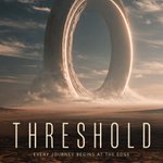
Was just messing around with megalophobia/sci-fi prompts in Midjourney, and the moment this generated, I could literally hear the Hans Zimmer score in my head.
Couldn't resist turning it into a fake movie poster. Crazy how adding just a little typography instantly makes a world feel real.
Poster version (1) Let me know what (2) or clean artwork you think! 👇


Prompt ↓
Street-culture magazine poster, [RATIO], full bleed. No mockup or frame.
Bright white paper. Enormous vermilion-orange ultra-condensed headline "[HEADLINE]", partly covered by one photoreal person cut out at dramatic scale: [PERSON + OUTFIT], [ACTION].
Let the action drive the layout: [HOW THE BODY OR OBJECT CUTS THROUGH THE LETTERS]. Keep the headline readable.
Type hierarchy: black condensed subhead "[SUBHEAD]"; one small note "[NOTE]" inside a thin hand-drawn oval; handwritten blue accent "[HAND WORDS]"; small footer "[FOOTER]". No other text.
Real skin, fabric and gear, clean cutout edges, soft contact shadows. Light ink wear only inside the orange letters; the white paper stays clean. A few electric-blue marker strokes follow the movement.
No logos, no fake text, no room background, no centered template layout.