

Data-driven visual content focused on global trends, investing, technology, and the economy. 📲 Creator on @VoronoiApp
Vancouver, BC
Joined August 2011
- Tweets17.6K
- Following3.3K
- Followers367K
- Likes2.3K






Mapped: Credit Scores Across All 50 U.S. States 💳
visualcapitalist.com/mapped-…

Visual of the Week 🥇
China, the United States, and India account for more than half of global greenhouse gas emissions. China alone contributes 30.3% of the worldwide total.
visualcapitalist.com/ranked-…

While a few countries account for most global emissions, the pace of change tells a different story. 🌍
Vietnam's CO₂ emissions rose 106% from 2014 to 2024, while the UK, Germany, and Japan recorded declines of over 20%.
See where emissions are rising and falling fastest: visualcapitalist.com/ranked-…

Frozen meat accounted for 18% of the UAE’s total food import value in 2025, highlighting the significant role of temperature-controlled supply chains in food trade 🇦🇪
Created in partnership with @DPWorldUAE, this graphic breaks down the UAE’s food imports by category, offering insights into the products that shape the country’s food trade landscape.
Learn more: dubaifooddistrict.com/?utm_s… #dpw02

The $128 Trillion Global Economy: Every Country’s GDP Ranked 🌍
visualcapitalist.com/the-128…

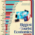
Ranked: The World’s Largest Tourism Economies ✈️
visualcapitalist.com/ranked-…

Ranked: The World’s 30 Busiest Shipping Ports 🚢
visualcapitalist.com/ranked-…

Quality of Life vs. Cost in 99 Cities Across the Americas 🌆
This graphic by Valerii Emelianov is one of the many incredible data-driven charts and stories from creators featured on our website. ✅
visualcapitalist.com/cp/qual…

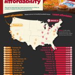
Ranked: The Most and Least Affordable U.S. Cities for Fast Food 🍔
visualcapitalist.com/ranked-…

Ranked: The Top 10 Cars Driven by Each Generation 🚗
visualcapitalist.com/ranked-…

Ranked: Countries With the Most Debt to China 💰
visualcapitalist.com/ranked-…

Shale Crescent natural gas prices stayed below European and Asian prices every year from 2006 to 2025 ⚡
Created in partnership with @ShaleCresUSA, this graphic shows regional natural gas prices across major markets.
visualcapitalist.com/sp/sc02… #sc02

Mapped: Salary Needed to Buy a Home in 50 U.S. Cities (2026) 🏠
visualcapitalist.com/salary-…

Ranked: 70 Cities in Asia and Oceania by Quality of Life vs. Cost 🌏
This graphic by Valerii Emelianov is one of the many incredible data-driven charts and stories from creators featured on our website. ✅
visualcapitalist.com/cp/rank…

Mapped: America’s Happiest States in 2026 😊
visualcapitalist.com/mapped-…

Ranked: The World’s Most and Least Free Countries 🕊️
visualcapitalist.com/ranked-…

Ranked: The World’s Largest Economies in 2026 🌍
visualcapitalist.com/the-wor…

EMBA students saw average salaries rise 17.5% during their programs, while 40% earned a promotion 🎓
Created in partnership with the @hinrichfdn, this visualization explores the forces reshaping global leadership, the career benefits of an EMBA degree, and what executives should consider when choosing a program.
See the full infographic: visualcapitalist.com/sp/hf11… #hf11

Mapped: Europe’s Surging Migrant Population (2000–2024) 🌍
visualcapitalist.com/mapped-…

Marriage vs. Divorce Rates, by U.S. State 💍
visualcapitalist.com/marriag…
