

Helping Dreamers & Small businesses 2x 🚀 their traffic + profit with strategic Web, App & UI/UX design 😎 32+ clients served...
BANGLADSH
Joined September 2012
- Tweets5.5K
- Following3.5K
- Followers277
- Likes51.8K






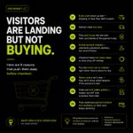


1/ Most product pages talk to the wrong person.
Buyers on a product page are rarely strangers. They know jar sauce exists. Many know the brand. They're asking "should I buy this one, now?"
I redesigned the top of the Saucerer product page with that in mind. 8 changes. A thread

1
3
44
6/ And for everyone:
8. Cleaner ingredients and allergen sections, so nothing slows them down
Same page, same product. Built for the people who are actually on it.
1
3
Small steps. Bigger impact.
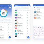
I designed a concept app to make reducing your carbon footprint feel doable. 🧵

1
1
24
Habits come from challenges, not lectures.
Walk 5 km, see 1.08 kg CO₂ saved right away.
"Day 5 of 5. You did it!"
1
5


Which change would you test first on this product page?
A) Product messaging
B) Reviews and trust
C) Bundle pricing
D) Delivery and returns
1