




كان لقاءنا مختلف جداً
ومألوف جداً
لا أدري كيف أصفه، لكنني لم أشعر بأنه لقاءنا الأول وجهاً لوجه، وكأننا التقينا من قبل، لأن أرواحنا وأفكارنا وقلوبنا التقت وتآلفت
سعدتُ جداً بانتقالنا من المواقع إلى الواقع💙💙💙🇲🇦❤️🇵🇸

-
غريبٌ كيف يمكن لشخصٍ أن يدخل حياتك من خلف شاشة، فتألف روحه قبل أن تعرف ملامحه، وتأمن لحديثه قبل أن تسمع صوته، ثم يأتي اللقاء الأول وكأن المسافة لم تكن يومًا بينكما، بعض اللقاءات لا تبدأ من اللحظة التي نرى فيها الوجوه، بل من اللحظة التي تألف فيها الأرواح بعضها..
.
@k0a48

خلــود retweeted

أذكار الصباح والمساء | مختصر جامع
اجعلها حصن يومك وليلتك:
الذكر
العدد
سيد الاستغفار
١
سبحان الله وبحمده
١٠٠
أعوذ بكلمات الله التامات من شر ما خلق
١
اللهم فاطر السماوات والأرض…
١
اللهم إني أسألك العفو والعافية…
١
اللهم بك أصبحنا…
١
لا إله إلا الله وحده لا شريك له…
١٠ أو ١٠٠
يا حي يا قيوم برحمتك أستغيث…
١
أصبحنا وأصبح الملك لله…
١
رضيت بالله ربًا…
٣
بسم الله الذي لا يضر مع اسمه شيء…
٣
حسبي الله لا إله إلا هو…
٧
خلــود retweeted
برّ الوالدين دَيْنٌ…
تُحسن إليهما اليوم، فيُحسن إليك غدًا.
تسمع أنينهما، فتُسمَع دعوتك.
تتنازل عن راحتك لأجلهما، فيجعل الله في حياتك من يعينك حين تحتاج.
لا تظن أن ما تقدمه لهما يضيع؛
فبرّ الوالدين عبادة، وأثرها يعود إليك في الدنيا قبل الآخرة.
فاغتنم وجودهما، وأكرمهما، وألن لهما القول، وأكثر من الدعاء:
﴿رَبِّ ارْحَمْهُمَا كَمَا رَبَّيَانِي صَغِيرًا﴾
🤖 Made with AI


Fluorescent Marker Travel Poster
GPT Image 2
Prompt:
ASPECT RATIO: 4:5
[DESTINATION] = [CITY / COUNTRY NAME]
Create a bold, sophisticated vertical 4:5 travel art poster for [DESTINATION], drawn entirely with only four fluorescent highlighter markers on pure bright white paper:
🟧 Fluorescent Orange
🟨 Fluorescent Yellow
🟩 Fluorescent Green
🟦 Fluorescent Blue
COMPOSITION
Select 2–3 real, instantly recognizable landmarks or architectural symbols that genuinely represent [DESTINATION].
Use one dominant landmark as the visual anchor, supported by one or two smaller landmarks. Integrate everything into one continuous, asymmetrical composition using overlap, cropping, scale contrast, and generous negative space.
Do not arrange landmarks side-by-side like a tourist brochure. Keep the architecture highly simplified but immediately recognizable.
HIGHLIGHTER STYLE
Construct the artwork only with visible broad-tip highlighter strokes — no black ink, pencil, fine outlines, or digital fills.
Use quick sweeping marks, transparent overlaps, uneven saturation, streaks, gaps, imperfect edges, visible stroke beginnings and endings, and occasional strokes extending beyond the architecture.
Do not carefully color inside buildings. Use a limited number of confident strokes to suggest rather than fully render the landmarks. Leave significant areas unpainted so the viewer mentally completes the forms.
Up close, the artwork should feel almost abstract; from a distance, [DESTINATION] should become unmistakable.
COLOR & WHITE SPACE
Use only fluorescent orange, yellow, green, and blue. Use all four throughout the composition and allow them to overlap naturally.
Keep approximately 50–60% of the pure white paper untouched. No gradients, shadows, black, gray, beige, pastel colors, or additional shades.
TYPOGRAPHY
Integrate the exact text “[DESTINATION]” naturally into the composition using the same fluorescent highlighters. Make it spontaneous, expressive, handwritten, and visually integrated rather than a conventional poster heading.
STYLE
Contemporary editorial illustration, experimental architectural sketching, Swiss graphic-design restraint, expressive marker art, museum-shop travel artwork, sophisticated handmade imperfection, bold negative space.
Avoid: photorealism, detailed architectural rendering, conventional skyline compositions, rigid grids, decorative borders, watercolor, vintage textures, cream/beige paper, and generic tourism-poster aesthetics.
FINAL FEEL: A destination remembered through only four fluorescent highlighters — energetic marks, enormous white space, imperfect strokes, and just enough architectural information for [DESTINATION] to suddenly emerge from abstraction.
High resolution, vertical 4:5, pristine pure-white background.


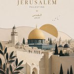
القدس - عاصمة دولة فلسطين 🇵🇸
🤖 Made with AI

Premium level editorial travel illustration
GPT Image 2
Prompt:
Create a premium editorial travel illustration of [DESTINATION], [COUNTRY/REGION] using a minimal layered cutout illustration style. IMPORTANT: This must NOT look like a busy handmade paper craft artwork. Instead, it should feel like a premium Scandinavian editorial poster, a modern travel magazine cover, a sophisticated museum-shop print, and an elegant minimalist paper collage design.
STYLE: minimal layered cutout illustration, large clean paper shapes, editorial paper collage aesthetic, bold geometric masses, simplified layered depth, soft subtle shadows, clean cut edges with slightly rounded corners, ultra simplified shape language, no photorealism, no handcrafted DIY feeling, no excessive texture, no visual clutter.
TEXTURE: extremely subtle paper grain only, smooth premium paper surface, almost invisible texture, no embossed texture, no heavy paper fibers.
COMPOSITION: vertical 9:16 poster layout, strong foreground/midground/background separation, large open breathing space, refined negative space, balanced premium editorial composition, minimal object density, avoid overcrowding.
FOREGROUND: minimal landscape forms only, clean abstract terrain representing [DESTINATION'S NATURAL FEATURE / WATERFRONT / LANDSCAPE], minimal environmental details, avoid dense plants and excessive flowers.
MIDGROUND: [ICONIC LANDMARK / ARCHITECTURAL ANCHOR], simplified architectural masses of nearby buildings or structures, strong recognizable silhouettes, minimal window detail.
BACKGROUND: [DISTANT NATURAL FEATURE / MOUNTAIN / SKYLINE / LANDSCAPE ELEMENT] in the far distance, large clean sun, simple rounded clouds, spacious atmosphere.
ARCHITECTURE: simplified isometric-inspired forms, geometric buildings, minimal window patterns, reduced micro-detail.
COLOR & LIGHTING: limited color palette (4–6 colors) featuring [PRIMARY COLOR], [SECONDARY COLOR], crisp white, soft slate blue, and pale grey, vibrant but restrained tones, clean white balance, bright neutral daylight, slightly cool-neutral lighting, fresh crisp whites, no yellow tint, no warm sepia tone, soft directional shadows only, flat but elegant dimensional feeling.
MOOD: calm, modern, refined, premium, slightly whimsical, mature high-end travel branding aesthetic.
TYPOGRAPHY: minimal elegant sans-serif typography with the text "[DESTINATION]", clean spacing and alignment, suitable size.
QUALITY: ultra clean edges, high resolution, print-ready, no blur, no noise, visually organized, premium design-forward aesthetic.
COMPOSITION:
ASPECT RATIO: 4:5 vertical poster format.


منذ اول الصباح، قرأت الكثير من النصوص
او الجمل
او قد نسميها مقتطفات
لا ادري
كلمات مرتبة معبرة، قد تلامس مكان ما بداخل احدنا
لكني لم اجد ما يعكس مابداخلي،
فـ … كتبت وكتبت
على ورقة
ورقة قابلة للتمزيق
لا مجال للاحتفاظ بها
لانني كتبت ما كتمت..
وما زال في الخاطر الكثير
رفقاً


"ثم ماذا!"
لا شيء
او ربما كل شيء
لا اريد التفكير بما هو آت
فقط اريد هداوة البال الآن
فقط
والأمان
فقط.
تناولت حبتي مسكن
بدون ماء
سُئلت: كيف؟
تبسمت وقالت: كما تعلمت ابتلاع الكثير من الكلام والمواقف، بدون "ماء"!


