

Visual Identity Designer. 4x Featured On @behance DM📨 or Inquiry Book a call: https://teapawt.org/t.co/zmZuKmS84p
Joined August 2023
- Tweets243
- Following223
- Followers78
- Likes1.1K



Pinned Tweet
Had such a good time working with @mamunrabbe on MUDGEAR! I created the brand identity and visual presentation, and he brought it all to life through motion. Loved seeing the project come together with you, bhai 🖤
1
11
286
What does connected work look like on the web? 🤟
For MESHIVO, I explored how bold typography, motion and open layouts could bring the brand’s promise to life: a clearer way to work, a stronger way together.


1
28
Started with “let’s explore a logo.”
Ended up building a whole visual identity.
One more version is never just one more version. 😂


2
3
59
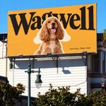
Took Wagwell out of the logo archives for a little walk.
Good branding deserves some fresh air. 🐾
🤖 Made with AI


30
Old concepts, fresh perspectives. 10 logos and marks, revisited and extended into visual identities.
Logos & Marks 2026 is live ↓
behance.net/gallery/25795011…
Which one’s your pick? 🤔
1
3
87
Some brand posters I designed for MUDGEAR. Exploring the energy of off-road riding through bold type, tight crops and the brand’s red-and-black palette.
Different compositions. Which one’s your favourite?🔥
1
3
100


Mehedi retweeted
Lots of people in the comments keep saying to never use big negative letter spacing. I disagree. This is what I use with Geist:
16px → 0%
36px → -3%
100px+ → -5 to -6%
The “never go negative” rule is for body text. At 100px+ the default spacing looks loose, because the gaps between letters scale up with the size. Tightening them is what makes big headlines look clean.
Body text stays at 0%. The bigger the text, the tighter it gets. Nothing goes past -6%, because past that the letters start touching.


Just hit 10 completed jobs on @Behance .
Not a big number on paper. Felt huge to me. Alhamdulillah, and thank you to every client who trusted me with their brand. 😎
See the work → behance.net/mehedi_shuttledo…
🤖 Made with AI
107
Mehedi retweeted

Things you can make with OnePromptDesign ↓


Can’t believe this is free 🤯 Save this!
OnePrompt has a huge collection of AI prompts for creating better visuals, mockups, ads, and more.
Save it now → onepromptdesign.com

Been developing MAEVE, a personal care concept built around softness, tactile materials, and quiet daily rituals.
This round focuses on Oat Milk, carried across soap, body wash, packaging, and campaign visuals while keeping the identity minimal and cohesive.
More soon.


6
193


Working on Ulivo, a passion project imagining an olive oil brand from Puglia, Italy.
Grove greens, handwritten lettering, and countryside illustrations bringing a little Italian warmth to everyday tables.
#BrandIdentity #PackagingDesign


1
7
132


header section complete for Gryphon🤞

Found @animosapp through a random reel and now I'm obsessed. No After Effects, no Jitter price tag, just premade templates that actually look good.
This is the Gryphon motion piece I made with it. Full project (branding + dev) still in progress, more soon.
3
118
Nobody thinks about ID card design until they see one done badly. This one's for Golden Touch. Small surface, but every inch still had to earn its place.

Last month, I wrapped up a big project's identity for MK WAY, where I work as their brand designer. Had a lot of fun implementing the concept across every brand touchpoint.❤️
Full project in Behance


1
1
71